Christmas experience as a starting point
For retailers, Christmas isn't a time for detail, but a peak. It's the time when the atmosphere, appearance, and cohesion all need to be just right. De Bijenkorf sets the bar high.
For this national Christmas campaign, we collaborated to explore the role of flooring as a connecting element between entrance, routing, and presentation. In collaboration with GJ Floors, we chose solutions that create tranquility, add warmth, and tell the same story across all branches, while still allowing room for individual character.
Three applications, each with its own role

Christmas Department – Warmth and experience
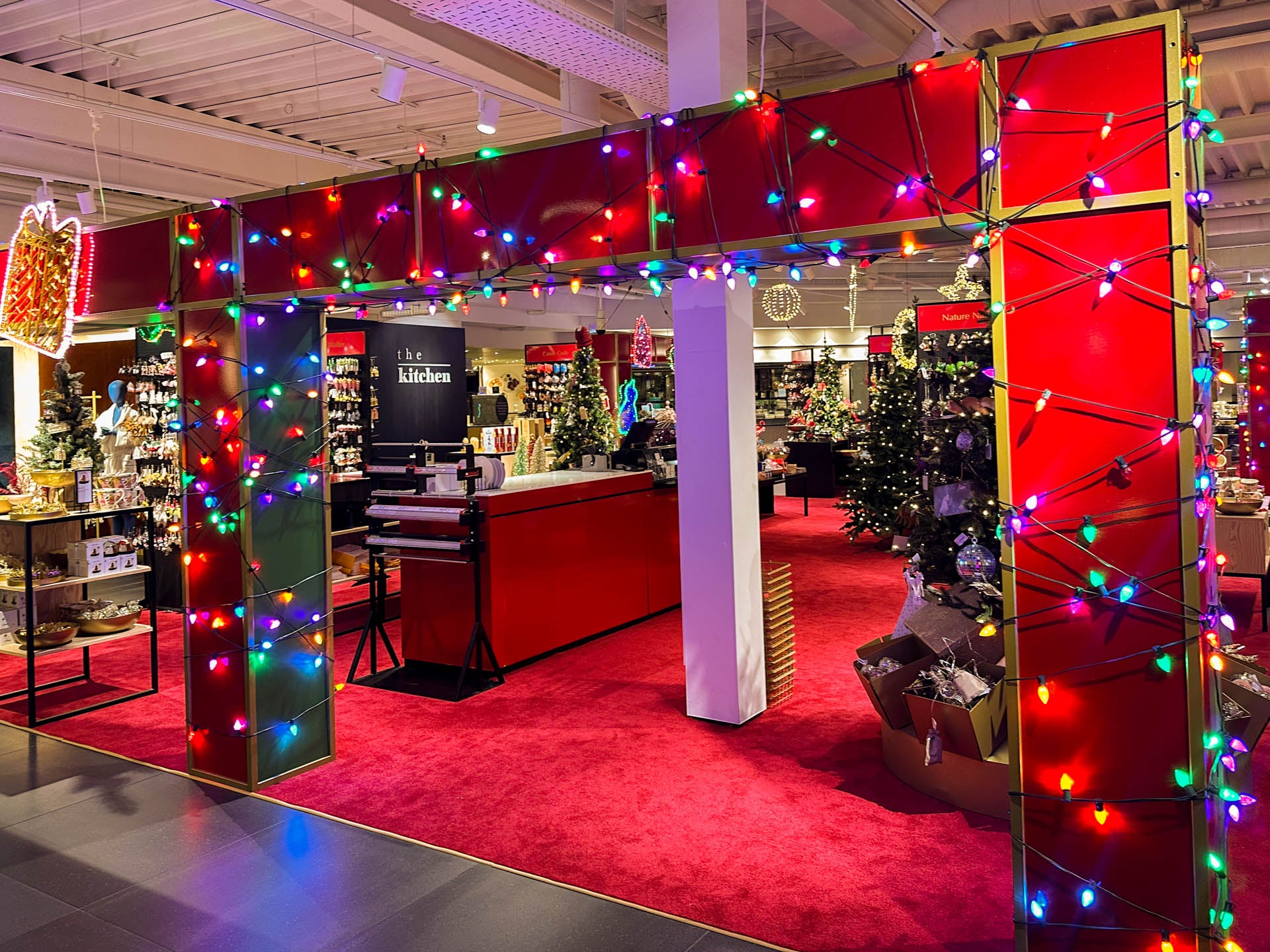
A high-pile, chic red carpet has been chosen for the Christmas department. Everything here revolves around feeling and experience. The carpet visibly adds warmth and invites you to linger, contributing to a relaxing and atmospheric shopping experience.
The soft texture and deep color seamlessly complement the luxurious look and feel visitors to De Bijenkorf expect during the holidays. The rug creates a calm, warm base for the Christmas display.

Winter shops & seasonal fields – Print as an extension of the concept
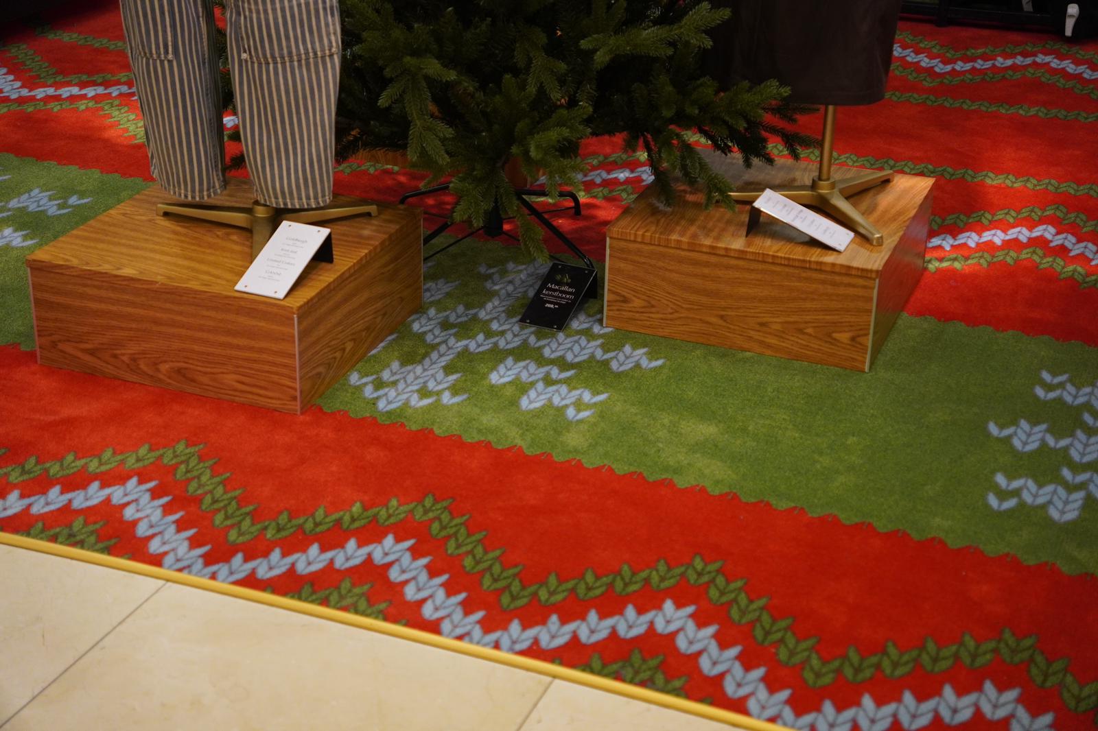
Custom-made printed carpet , produced in wall-to-wall widths of 400 cm, was used for the Winter Shops and seasonal fields. The Essenzo 1100 custom-made printed carpet with action backing was chosen.
The rug features a sharply defined print and a unique motif entirely dedicated to Bijenkorf icon Bob the Bear. The pattern of his sweater has been carried over to the floor, creating a cohesive narrative between the presentation and the rug.

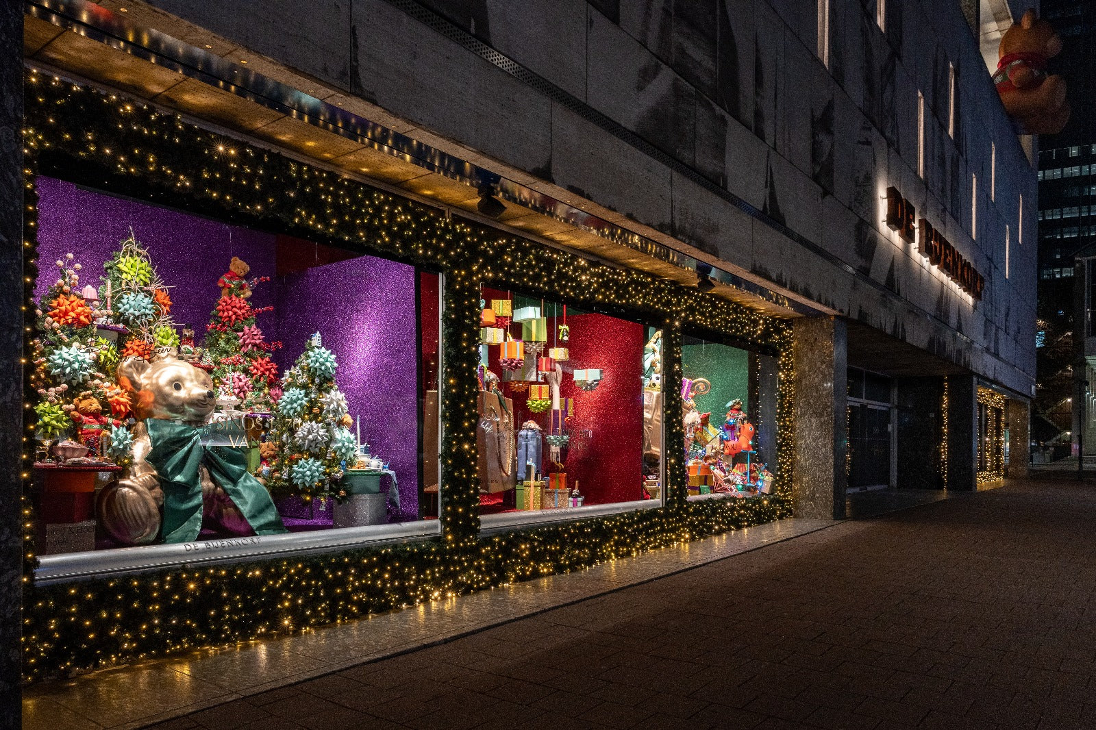
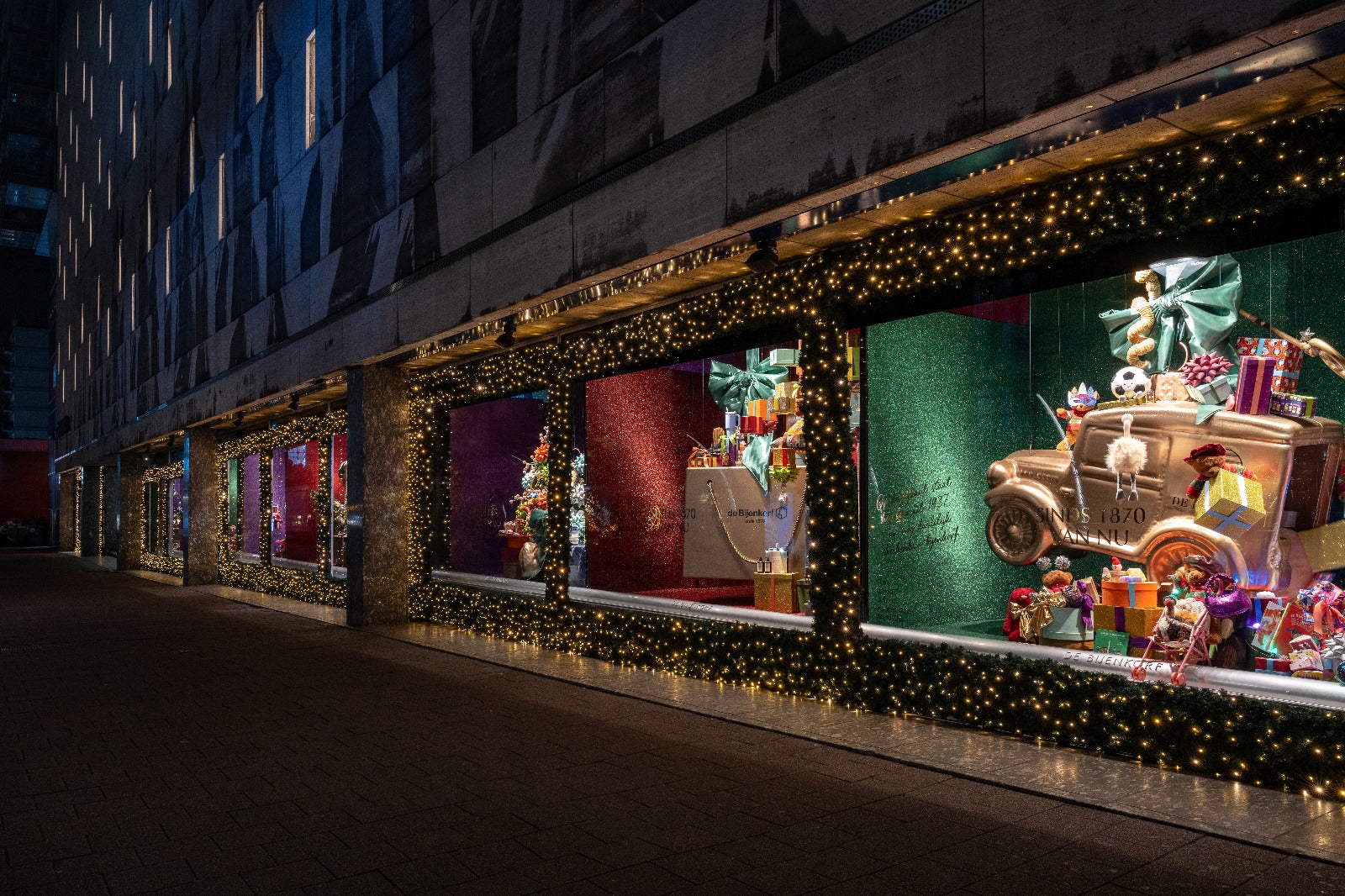
Shop windows – Add an extra touch with a glitter carpet
Glitter runners in red, purple, and green were provided for the windows. These carpets add a touch of dynamism and immediately draw attention to the streetscape, giving the windows a strong, festive appearance from the outside as well.
The sheen and color enhance the presentation's luxurious character and seamlessly integrate with the Christmas season. Furthermore, the glitter carpets feature prominently in online images and videos, providing contrast, recognizability, and added visual impact within the overall Christmas concept.


National rollout with attention to detail
The project was implemented at all locations: Maastricht, Amsterdam, Rotterdam, Amstelveen, Utrecht, The Hague, and Eindhoven. It was carried out within a short timeframe and often before or after opening hours.
By starting preparations early, usually as early as May, and focusing on planning, sizing, print quality, and logistics, a high-quality and sustainable solution was achieved that can withstand intensive store visits.
Additional work in the Amsterdam office

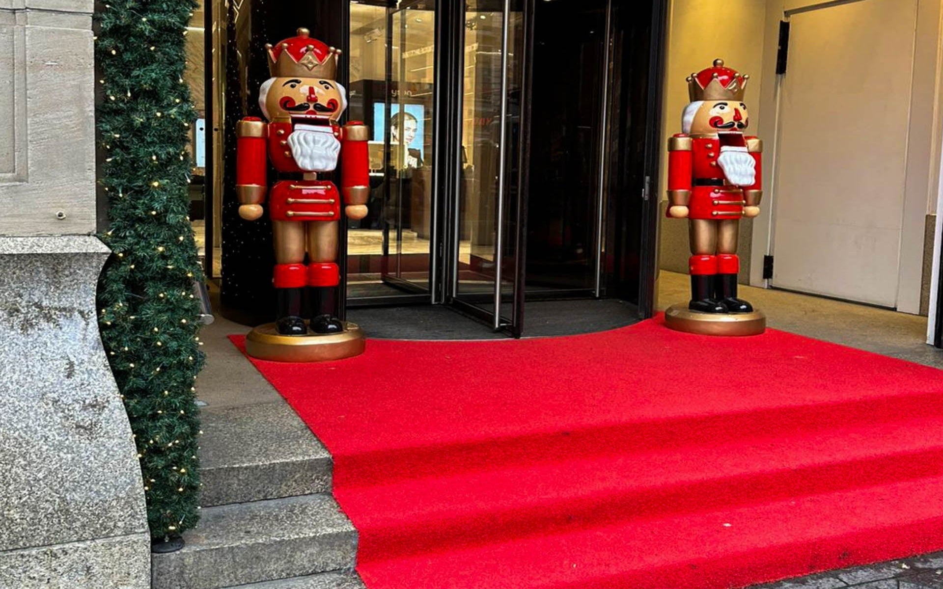
Entrance – A warm welcome with Dura
Dura Red has been used at the entrance. This durable outdoor runner immediately creates a warm and inviting atmosphere while also withstanding heavy use. The deep red color creates a warm and inviting welcome and remains beautiful and vibrant even in changing weather conditions.
Dura is dimensionally stable, colorfast, and quick to install. This makes it a reliable solution for entrances and outdoor areas where aesthetics and functionality converge. The runner stays in place, is easy to clean, and maintains its appearance during busy periods, precisely where first impressions count.

Ground floor – Peace and care with Solid
Solid red , a functional entrance mat with a professional appearance, was chosen for the ground floor. This mat effectively absorbs dirt and moisture and contributes to a neat, professional shop floor, even with high footfall and intensive daily use.
The polyamide material feels solid, remains stable, and is easy to maintain. Thanks to the custom solutions, Solid seamlessly integrates into the space and supports a smooth flow of traffic without disrupting the store's appearance. Functional where necessary, aesthetically pleasing where desired, and reliable in an environment constantly subject to high footfall.
From separate applications to one whole
This project deliberately went beyond individual applications. By placing different accents in each room, yet maintaining a shared vision, we created a Christmas collection where materials, colors, and textures enhance each other. In the next section, we'll show how these choices come together to create a single, recognizable whole.


The Christmas collection in coherence
The strength of this Christmas collection lies not in a single application, but in its coherence. By consciously choosing materials, textures, and colors for each department, a seamless transition is created between departments, presentations, and display windows.
The deep-pile red carpet in the Christmas department creates warmth and luxury, while the custom-printed carpet in the winter shops visually enhances the narrative. The glitter carpets in the windows provide the first point of contact with visitors and set the tone even before they enter. Together, these applications create a recognizable Christmas image, without feeling repetitive.
A Christmas experience that is right
The stores exude tranquility, warmth, and luxury. The red accents create a sense of familiarity and ambiance, while the flooring solutions contribute to clear routing and a well-maintained overall look. The result is a shopping environment that feels pleasant for visitors and is practical for the people working on the floor.
This project underscores the importance of a solid foundation for retail experience. Through close collaboration and a keen eye for detail, a Christmas concept was created that is not only visually compelling but also functionally sound at all locations.
